Fashionable Decks with a Fragrance
-20-
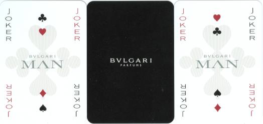
Following our noses, we came across this deck during a meeting of the Dutch collectors. It's the first "Bulgari" deck with a non-standard design, that we've ever seen. Maybe it's handed out with the acquisition of the perfume, in which case we were once again lucky to avoid that.
The deck was probably printed by Carta Mundi from Belgium and was published by Bulgari to promote their latest perfume, which is called MAN and was released in September 2010. All the cards, the pips included, have a center design with the suit symbol. On the courts it's more elaborate and the indices are made part of the center design. These designs however reveal some oddities.
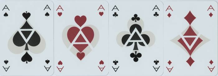
But first a word about scanners. They usually spread much light on the object and that sometimes causes soft tones in the design to disappear from the final image. That was the case with this deck here too. So here below we'll first show you a scan of the aces as it was done with the standard settings. It shows the cards as they are, white. The second one was done in adapted settings of highlights and middle tones. This scan shows the soft grey, which was used in the design. Normally our eyes can see that grey tone on the white surface, but it's hard to catch for scanners.
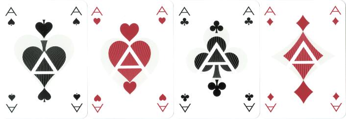
In the first scan there's an A in all the center designs and it stands up-right. What can't be seen is that on two of the backs the words Bulgari Parfums are upside down. So obviously the designs aren't meant to show the A's in this way. In the second scan all the backs are in the correct position and that results in an upside-down A on the Aces of Spades and Diamonds. But apparently that was the designer's idea. Just like the text on the backs, on the faces of all the cards the soft grey suit symbol is in the correct position in each suit. This goes for courts as well as pips.
In order to see the actual designs we'll show adapted scans of the courts. Although the soft grey suit signs are all in the correct position, as you can see, the designer has inverted the dark black and red suits on some of the courts, just like the letters. These have been placed upside-down, tilted 90% and even mirrored horizontally. It seems to have been done randomly. Although this doesn't apply to the Diamonds, as this symbol can be inverted without changing the image, the only rule seems to have been that the suit symbol on the Queens is in opposite position to those on the Kings and Jacks in that suit.
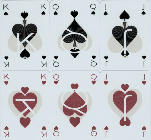
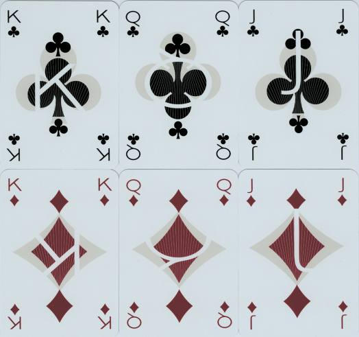
The typographical nightmare was probably meant to confuse the player, but fortunately there are 4 indices in the corners too.
The box is white with a black band, lettering is done in silver (often a nightmare for a scanner too).
-1- -2-
-3- -4- -5-
-6- -7- -8- -9-
-10- -11- -12-
-13- -14- -15-
-16- -17- -18-
-19- -21-
XPOHOME