|
|
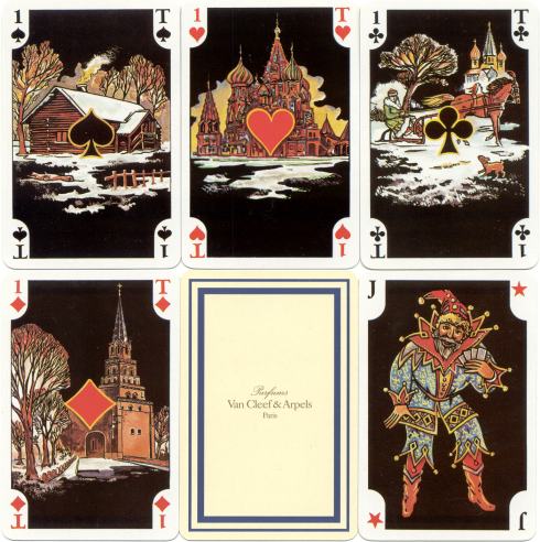
This deck was published by Dusserre for Van Cleef & Arpels Parfums. |
Fashionable Decks with a Fragrance
-2-
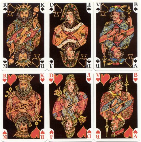
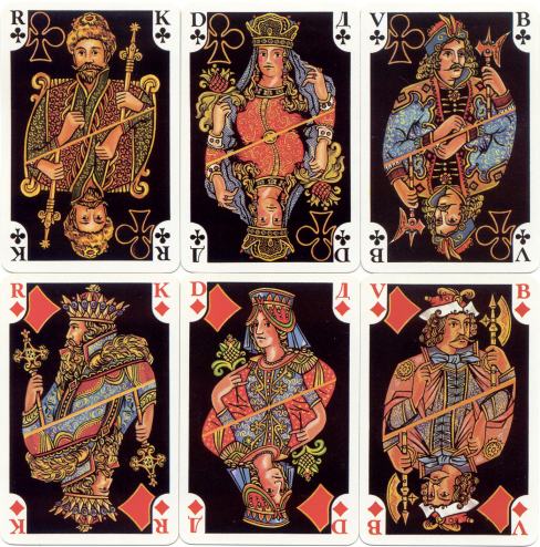
The world of fashion has always had the aura of richness. Most of the decks express that feeling in some way or the other. The deck here below has a black background. This feature, by itself, gives a deck a luxureous look. The use of gold(like) colour to outline the suitcolours enhances that look. Some of the other decks, like the Lanvin deck on page 1, have solid gold edges. That works even better!
|
|
This deck was published by Dusserre for Van Cleef & Arpels Parfums. |
|
At first sight the deck shows great resemblance with a Russian deck, that was published in 1967 as Palekh and also had a black background. The designs of the courts however are different and there were no illustrations on the aces in the Palekh deck. |
|
On pages 11 and 12 there's another deck for Van Cleef & Arpels to be seen.
-1-
-3- -4- -5-
-6- -7- -8-
-9- -10- -11-
-12- -13- -14-
-15- -16-
-17- -18- -19-
-20- -21-
XPOHOME