 |
|
| |
|
 |
 |
|
The PAGAN deck by Peter Dunham and Linnea Gits is the 4th in a series of 6 decks and it was published in May 2014. For each deck they have used a different technique and sought a different angle of approach. This time the technique was old fashioned oil painting and it was used to create a wonderful "four seasons" deck. |
|
|
The publication by the Uusi Studio was financed through Kickstarter, a crowd funding site for artistic and cultural initiatives. Thus far each of the Uusi decks has been funded through Kickstarter and it may be worthwhile to check out their latest "Hotcakes" deck there. Click HERE for a visit. Maybe even become a "backer" too for their last deck in the series of 6. |
|
After the
release of the Royal Optik deck Linnea and Peter took a vacation and spent that
in the woods. It must have been there that the idea for this deck was conceived.
On the Kickstarter site they say it like this: "Our inspiration for "Pagan"
came from our love of the great forests and lakes of Northern Wisconsin and
Michigan's Upper Peninsula. The smell of the woods, their silence and the
enormous beauty of the forests and lakes in that region of the US has always
inspired us. When you are deep in the forest the feeling of wilderness is
intense and it was that feeling that became the creative starting point for our
new deck.
Taking that primal experience and expressing it visually led us to the Pagan
era. This was a time in history when religious belief went hand in hand
with people's everyday interaction with nature. The expression of this belief
played out in different festivals, customs and myths in countries around the
world. We chose the pagan regions and customs that covered the fjords and
forests of Scandinavia, to the mountainous lands of Central Europe and the misty
shores of the British isles to finally, the vast, endless forests and tundra's of
Russia for inspiration. Those lands bear a resemblance to the forests of the US
whose trees, plants and woodland animals and their intense, earthy colors made
their way into the costumes, pips and patterns we created for the original
artwork in the "Pagan" deck."
 |
Although the correct order of the seasons and their suits can be found on the Pagan calendar, which was offered as an extra reward, it's not hard to identify the seasons by looking at the cards. |
|
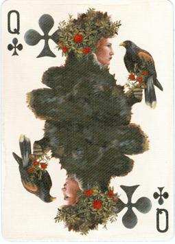
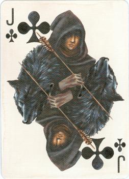
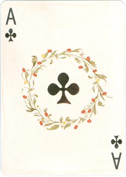
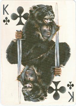
In the Clubs suit there's a lot of fur used in the clothing. It obviously refers to the winter, which consists of the first 3 months on the calendar. These are usually the coldest ones. |
|
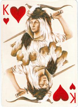
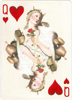
The Hearts suit was probably chosen for spring, because matters of the heart prevail in that period, when hormones are acting up and there's love in the air. |
Didn't Frank Zappa already identify the cowbell as
|
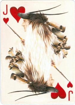
But the cowbells may also refer to the keeping of small animals as a way of living, opposite to the hunting on them, like the King and Jack of Clubs did with the bear and wolf. |
||
|
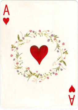
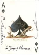
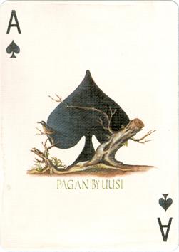
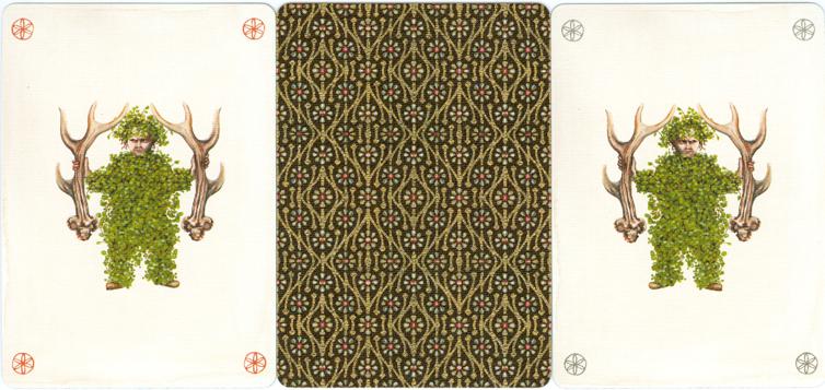
As in most American decks the Ace of Spades is a bit special. Here too it gives the name of the deck and maker and it's extra illustrated with a felled tree, that is living on and is set here as an example of the phrase "bowed, but unbroken". The other aces have a simple decoration; the name of the printer, the USPCC, is mentioned on the ace of Diamonds. |
||||||
 |
|
|
|
|||
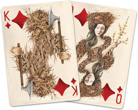
|
The Diamonds suit represents the summer time, July, August and September. In the middle is the image from the Kickstarter page and there are two observations to be made. First and most obvious is the redesigned Queen. It was Linnea who wasn't very happy with her. In her own words: "I never liked the way I painted the hair on that Queen – it seemed a little too "modern" of a look and her face wasn't right. I went back and took out her hair, (imagine it all under the crown) and reworked her face and body so that she looked a little more Medieval. As soon as I did that I loved her!!". |
|||
 |
|
|
|
|
|
 |
Secondly and pretty obvious too: there's less contrast in the designs, because they have been printed brighter. That doesn't at all do justice to the designs, but on the other hand it suggests a scorching summer heat, that has dried out all the bushes and the crops. The sun can literally bleach colors and these bush people here seem to have become the victims of that. |
|
|
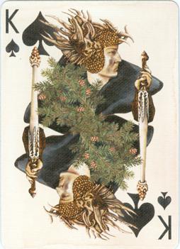
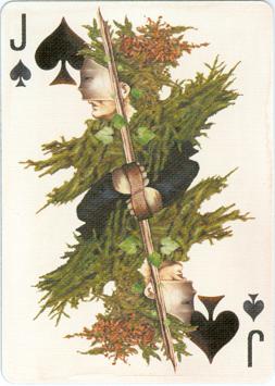
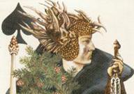
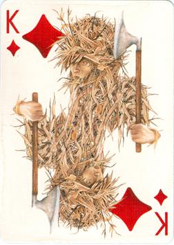
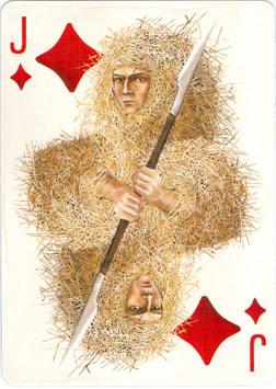
Fall is formed by October, November and December and here fur trees represent the season. It's probably not a coincidence that fall and winter form the black suits.
|
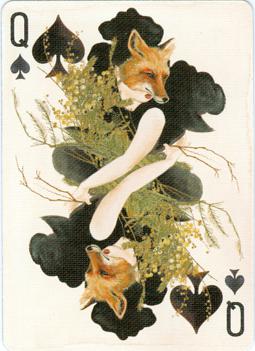 |
Personally it's my favorite suit, with the intriguing organic helmet-like head wear of the King, a true "foxy" lady as Queen and the mysteriously masked Jack .............................
|
|
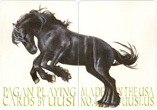
Extra cards often carry an advertising message from the manufacturer, a calendar or a score count card for bridge and some are even blank. Those cards are the first to be thrown out before playing a game. In the Bicycle brand the USPCC prints decks of 56 cards. Peter and Linnea were the first designers to use the two extra cards as a diptych in the Royal Optik deck and they are turning this into a tradition for the rest of the series. For "Pagan" their diptych image is based on the mythological pagan horse called, "Sleipnir". As Norse legend has it, Sleipnir is an eight legged horse who is the favorite steed of the Norse god, Odin.
The 2 jokers were designed to be true "wild cards".
 |
The deck consists of 52 cards, |
|
|
It was published with a dark and a light back design. There's a gold foil layer on the boxes that gives them a shiny, luxurious look. The dark edition is limited to 3300 copies, the light edition to 2800.
|
||
|
The
designs of the above courts and aces can be found in a later edition
in 2019 as Ivory Pagan Playing Cards. |
||
BLUE BLOOD (1)
BLUE BLOOD - REDUX (1bis)
BOHEMIA (2)
ROYAL OPTIK (3)
HOTCAKES (5)
CLASSIC (6)
or