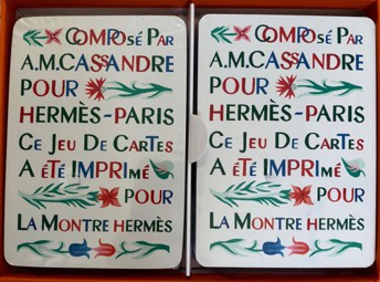
 |
The
CASSANDRE
deck
2nd version
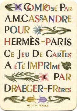
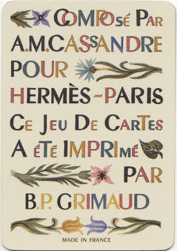
Shown here is
the title card. A quick comparison with that of the first version shows
that the design on the card remains the same, but that the words
"made in France" were added. We see a similar thing on another
card, so it is possible that the second version was made for the export
to Anglo-American countries, as the "extra
information" is already given on the card, but....in French. |
|
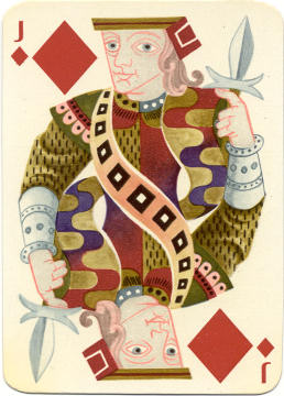 |
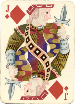
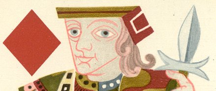
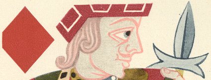
The differences are not numerous enough to show all the cards of
the second version. The major change lies in the design of one of the courts.
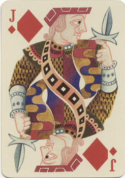
The designs of the courts in both versions are all the same, except for the Jack of
Diamonds. On this card the original design was almost completely left
intact, except for the head and hat of the Jack (see fig.1 and 2 for
details).
Because of
this change the whole upper right part had to be re-designed. The Jack's dagger has been
redrawn and has a somewhat different shape in the second version. Also
the Jack's index finger was redrawn. |
|
|
|
|
 |
|
|
fig. 1 (first version) |
fig. 2 (second version) |
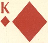
A second important change is in the type font and the placing of the
letters in the design of the courts (fig. 3 and 4). The type font in the first
version was probably designed by Cassandre himself. It is in line with the
modern designs. The new chosen type font is more classic and could work better
for Anglo-Americans.
|
|
The first
version has a type font without serif, the small horizontal lines on top and
underneath. The letter and the repeated small suit sign are placed beside the large suit sign. |
|
fig. 3 |
|
|
|
In the
second version the type font with serif is also a bit bolder, higher and
wider, so the letter and small suit sign had to be placed closer to the
large suit sign, thus cutting a piece off the suit sign. This is seen in
all suits. |
|
fig. 4 |
|
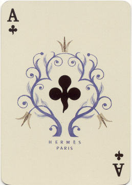
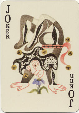
Other -smaller- differences can be found on the Ace
of Clubs and Joker(s).
|
|
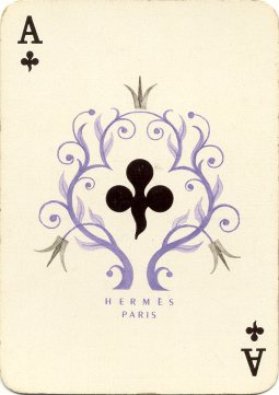
The
designs of the Aces remain the same in both versions. However in the
second version the names of Hermes and Paris were added underneath (fig. 5).
<Ace
of Clubs and Joker from 2nd version>
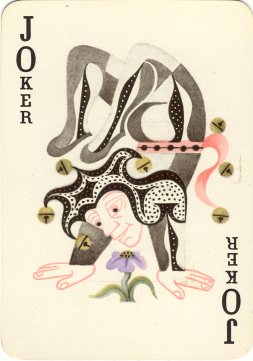
The change
of type font is probably also important for joker collectors. They are
often interested in small differences between similar jokers and treasure
different versions of a joker (fig. 6).
So..... check your collections! |
|
| fig. 5 |
|
fig. 6 |
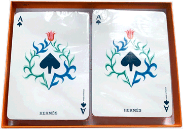
The last difference is the number of cards. The deck from
the first edition was published as a "53 cartes" deck: 52 cards and 1 joker. The
title card apparently wasn't counted. The cards have gold edges.
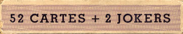
This card isn't counted in the second
edition either, but the deck has 2 jokers now, as is printed on the sides of the box. The
type font on the box is the same as that of the first version, but slightly
slimmer. The cards have gold edges.
 |
The
CASSANDRE
deck
3rd version
Shown here
again is
the title card. A quick comparison with that of the first and second version shows
that the design on the card remains the same until "a été imprimé
par", but then the name of B.P. Grimaud is mentioned as
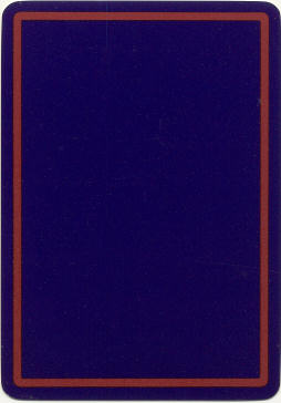
manufacturer. The back design was also changed. It exists in opposite
too, red with a blue line. All courts, Aces and Joker have the same
design as the second version. |
|
|
|
|
The "Grimaud" deck consists of 52 cards, 2 jokers
and 1 extra (title) card.
The same type font was used as in the second
version. The cards have gold edges. Our deck came without a box.
I found the latest version on the French eBay in April
2020, but at a ridiculous price.
So copying the picture was the cheaper way to add this here.
And maybe the 2nd double deck, published by La Montre Hermès, dates from that
same year.
BACK
VARIATIONS