DONDORF vs
LOTREK
A CLOSER LOOK.
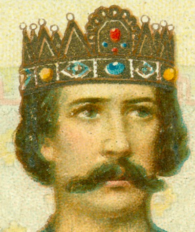
Chromolithographic printing is a craft and
Dondorf was well known for the quality of their printed products. The 100 Years deck was
supposed to be the highlight of their craftsmanship and with 16 colors (stones/print
runs) for the fronts and 12 for the backs it's by far the most elaborate deck that the company has produced. The chosen
card is smooth and when you feel the surface all the color printing feels
smooth, except for the crowns and other details. Run your fingertip over the
card and you can feel the details. If you hold the cards in the light at a
certain angle, you can actually see the "gold" details laying on the
surface. And....at a different angle they actually look brighter, more gold
like. They seem to have been printed in the last
run. The color isn't gold, but rather a more bronze like color. Printing real
gold details wasn't unknown in those days, so one may wonder if that bronze
color wasn't used intentionally. In the digital upgrade this color was replaced
by gold, but in such a way that the result is rather disappointing, at least in
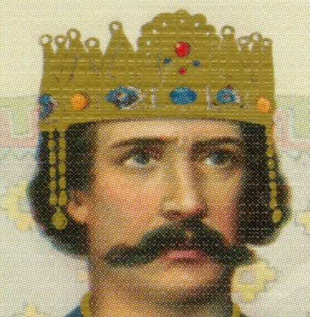
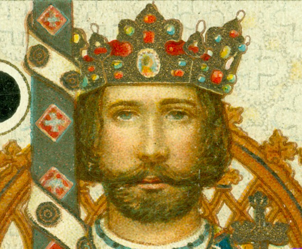
my opinion. The crown here below will illustrate this.
Except for
the gems the different colored details are almost completely lost and the crown
looks rather flat. That effect is enhanced by the air-cushioned card that is
used. It leaves straight horizontal white lines of dots across the design. Personally I
don't feel that this is an upgrade, digital or not. There's one other detail
that jumps out: the gold hangers on both sides of the crown. I can't spot them
in the original, but.... I can feel and see them on the card. I guess Lotrek had the
same and maybe has used further enlargements to come to these gold hangers. However, I
don't think that they were originally meant to be as visible as they are now.
 |
|
|
In a museum I sometimes get intrigued by a painting and
study it very closely. Get as close as allowed and follow the brush
strokes, see how the artist has worked. Maybe it's the same reason why I
like to bring a magnifying glass to chromolithographic printed cards, you
can see how the artwork has been created, see how the shades have been
made from a mix of different colors. For me the chromo portrait here above
is much
more alive than the offset one. But again, the air-cushioning doesn't help
there.
|
 |
|
|
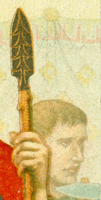
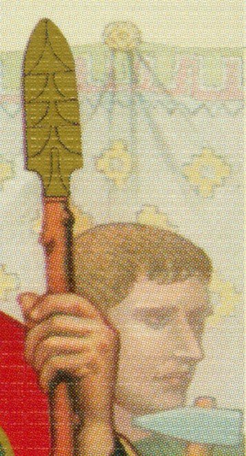
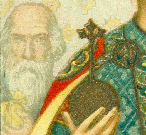
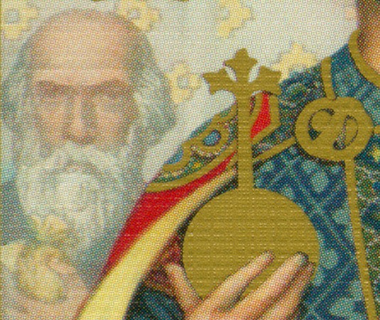
For the spearhead of the lance Dondorf has used that
same bronze color and one can feel the printed detail. In the new
upgrade it was replaced by the brighter gold printing (except for the small
rim at the bottom).
Therefore the details had to be done in black. The Dondorf craftsmen
gave the wooden pole some darker spots to create a bit roughness of the
wood. The new pole seems much smoother and made of a more refined type
of wood.
The dimensions of the pole, hand and spearhead are kept, but in the
background 1 or 2 mm are gained by stretching the face a bit.
|
 |
 |
|
On the other side of the main figure the background
has also been used to adapt to the wider dimension. But this image
shows that here too the
main difference is the gold printing of the orb and again the ball
shape has been flattened completely. Where the original orb has at
least some
lines to suggest a round shape and the ornament on top a lighter
lining to suggest depth, there is just a flat, gold printed shape in the new
version.
|
 |
|
|
Comparing the details
of the crowned head of the King of Clubs, shows the loss of detail by the
gold printing in the new design. Not only on the crown, but also on the
circular decorations on the left. And this loss of detail is found on
practically every court card, even visible in actual size. In the crown
one detail has been carefully redrawn: a cameo with a woman's portrait prominently in the front of the
crown. In one of the articles it was presented as a hidden or
undiscovered cameo of someone special in the artist's life, discovered by
Lotrek. However, the spot is pretty visible on the actual card and I'm
sure that when the decks were printed the sheets have been inspected under
a magnifying glass too. So the suggestion, that the artist had secretly
slipped this in, can't be true, but..... it would have made a nice new
myth about this deck.
|
For me this last portrait is a good
example to show that chromolithographic printing is still a technique that is
superior to offset and that using modern, digital ways to (re)create a design
and modern air-cushioned card are not always an improvement. However...
Although in details the Lotrek version isn't as attractive as the original
Dondorf deck, in the overall comparison (previous page) it reflects the spirit
of the original sufficiently. So if you don't have the original, the Lotrek
deck will probably give you just as much pleasure to look at as the original.
In his CTD article Paul asked two questions, important tests for him: Do I
feel pleased to have it in my collection? and Would I prefer to have my money
back? I too find these questions important and in this case I too answer them
with a firm yes to the first and no to the second question.
Brings us back to the semantics. How to
call this publication? It's not a reproduction nor a restoration and looking
at the loss of detail in my opinion not an upgrade either.
In the online magazine of the 52+Joker
club, Card Culture #25 (December 2016), 5 longtime playing card collectors
gave their thoughts about the role and value of reproductions. I've personally
met 4 of them and the only one that I have never met was Dr. Joseph Zompetti.
He began his comments with the following statement: "I understand that reproduction decks are not always genuine representations of the original, and they may even be considered
"bastardizations" of the originals. I don’t think that reproduction decks should ever take the place of our respect for, and appreciation of, original antique and vintage decks."
Although I agree with the general idea, bastardization has a rather negative
connotation and I wouldn't apply it to this publication. Lotrek Oath's work
deserves a more positive qualification. A digital remake maybe?
01 - 02
BACK