October
2018
 |
During the last weekend there was
a large general collectors fair in Nieuwegein (Netherlands). This year
there were 2 surprising, high quality items that Joop spotted. The first
was a marble table top with a hand painted trompe l'oeil of playing cards
on it. The price was rather high and Joop had to remind himself that we
collect playing cards first and that artifacts with playing cards come
second. The other surprise was a hand painted transformation deck,
probably Dutch. The 52 illustrations must have been done by a
professional painter, as they are all very delicate, detailed and the
watercolor technique is of a stunning quality. Unfortunately the seller
wasn't selling it until she had a better idea of prices. But... we have
her email address!
|
 |
For this month
we chose a deck that had been on our wish list for years and was one of the
about 350 reasons to buy the LB collection. The deck was supposed to be the
highlight of the Dondorf decks, the ultimate example of the company's
craftsmanship in design and chromolithographic printing. And it is!
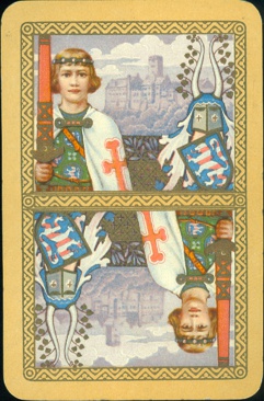
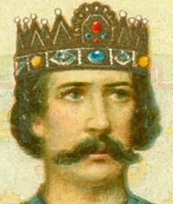
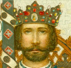
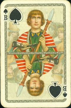
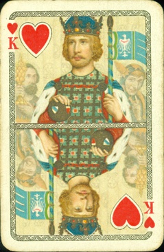
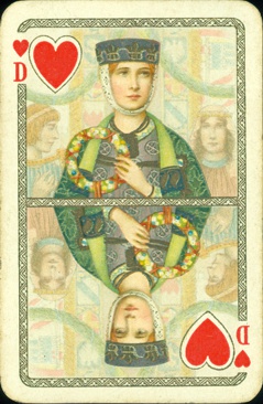
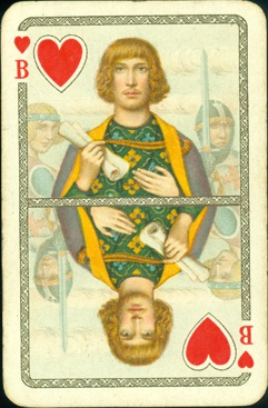
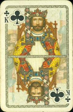
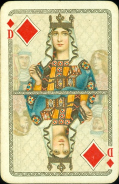
The 100th anniversary deck is the most elaborate deck of the Dondorf company. It took 13 print
runs to create this deck, so 13 times of preparing the stone and seeing to it that
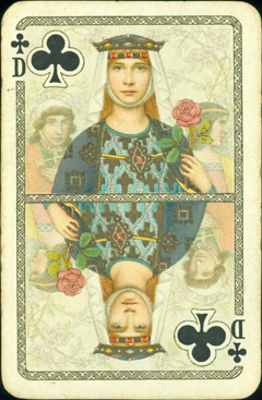
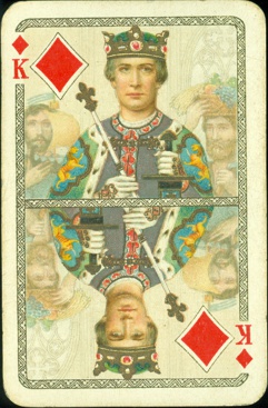
all the colors got in the right places. Each of the court
cards doesn't just show a courtly figure, but presents a complete scene that
fills up the background in soft colors. It shows the entourage of each of the courtly
figures, but because it's done in hazy soft colors it emphasizes the courtly
figure at the same time.
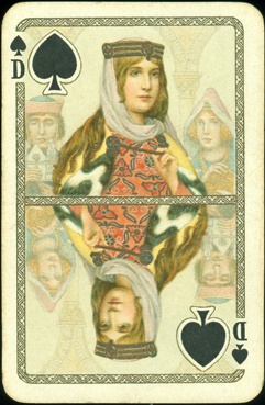
The courts
are dressed in mediaeval costumes, that are richly decorated and show fine
details. The printing was done on a smooth kind of card, but when you move your
fingertip over the cards you can feel the "gold" details. Those must
have been printed in the last run. It's not actual gold and when enlarged it
looks like a combination of a somewhat darker bronze base with gold grains. In
the light, under a certain angle the details look brighter, more gold like.
However, under an other angle these details look mat and much darker and you can
see that they are laying on the surface of the printed card. When you look at
the crowns and see the measure of colored details within the "gold"
layer, it speaks for the craftsmanship of the printers.
It is this quality of printing and design that has made the name Dondorf famous
all around Europe and in some other parts of the world. We know Dondorf for
their playing cards, but the company has produced bonds and banknotes as well as
labels, postcards and all kind of printed matter.
 |
|
|
|
THE MYTH |
|
is an established story among collectors that this deck
was -while celebrating their 100th anniversary- the deck that brought the
Dondorf company down in 1933. It is true that in that year the Dondorf
factory in Frankfurt am Main came in the hands of the Vereinigte
Altenburger und Stralsunder Spielkartenfabriken (VASS). But.....
|
 |
|
 |
|
THE TRUTH |
|
is that the financial situation was so difficult that in
1929 the Dondorf board had already decided to split up the company in six
parts and sell each of them separately. In that year the playing card
manufactory was sold to Flemming & Wiskott AG from Glogau and the
games publishing house was sold to J.W. Spear & Son from Nürnberg. Flemming
& Wiskott kept the printing factory in Frankfurt and kept publishing
decks under the name Dondorf. Even the VASS kept the name Dondorf for a
while in their assortment.
|
 |
 |
 |
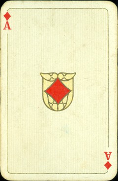 |
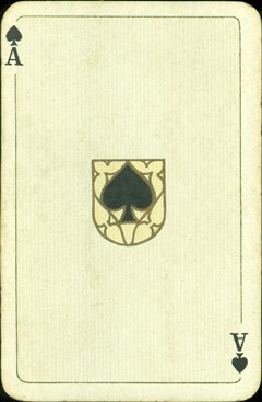
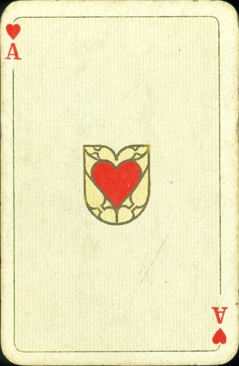
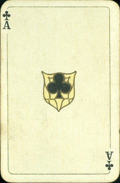
| On the aces the pips have
a gold colored outline and are set against an embellished shield-like
shape. |
 |
|
|
|
|
|
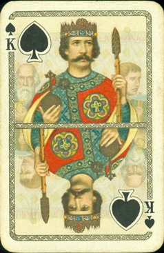
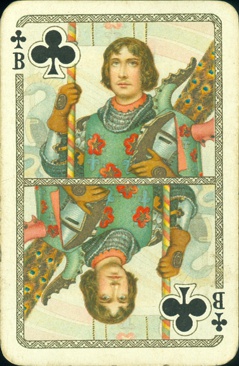
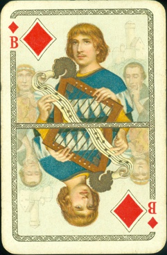
Although
all the other courts have 2 individuals from their entourage in the
background, the Jack of Clubs seems to stand alone. He is holding a
fierce looking horned helmet and his world is one of banners and lances.
There's only what seems to be a swan-shaped helmet and part of a shield
with a swan on his left.
|
 |
|
|
|
|
|
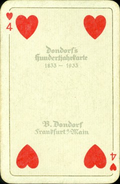
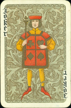
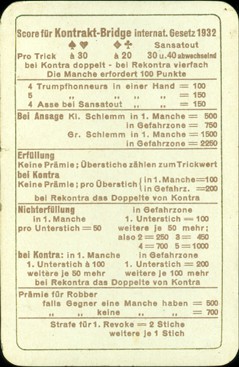
The title and maker of the deck are printed on the 4 of Hearts. The deck
comes with 2 jokers and a bridge score card from 1932.
|
BACK TO PRESENT
MONTH