November 2015


Two collectors fairs this month. Unfortunately Miriam wasn't feeling well enough to attend, but Joop spent a Friday and Saturday on both of them. 
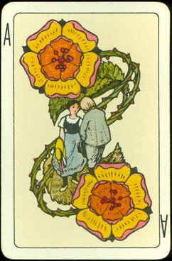
The first one was in Nieuwegein and already on Friday he had bought a few nice decks to trade and he had also spotted a nice addition for our own collection. That was the first thing he bought the following day. Later that day a dealer offered him a complete, original edition of the French "Total" deck, in a sort of book, illustrated by Siné.
The second collectors fair is the largest one in the Netherlands and was held two weeks later. The quality of the offer was very good this time. Although he didn't find any decks at all on Friday and only one French deck and a simple, but nice playing cards press in Art Deco style on Saturday, it was still nice to see all the different collectable items, from elegant pottery and silver ware to antique toys, Roman coins or vintage household products. It seems that you can't name it or there's a collector for it.

The internet didn't bring any surprising decks, but we got a nice French design for a playing card in watercolor. Unfortunately there's not much time to spend on the Dutch auction site or any of the different Ebay's. 

So an extremely short shortlist made it an easy choice this month!


The deck was printed in chromolithography by J. Müller & Cie from Schaffhausen, Switzerland. It was published in 1921 as "No. 41 Schweiz. Luxusjasskarte", but among collectors the deck is also known as "Künstlerjasskarte", which can loosely be translated as artist designed cards for the game of Jass. The makers name is on the Daus (ace) of Shields.
The artist in question here was Arnold Oechslin, who lived from 1885 until 1960. He was born in Schaffhausen. He finished an apprenticeship in sculpting and then moved to Nürnberg and Berlin to finish his artistic education in graphic techniques and landscape painting. He got married in Berlin, but returned to Schaffhausen in 1917, where he became a teacher of graphic arts at the Pestalozzi school.


The Kings are depicted in a serious pose, although one may wonder if the king here below is thinking about most important state matters or just taking a nap. 


The designs present a frivolous version of the traditional Swiss pattern, that is basically just as "flat" or clear lined as the English pattern. Here the figures come to life. The style of their designs is Jugendstil-like.


In the classical pattern the King of Roses is standing up, while all other kings are seated. In this deck he too is seated on a throne.

The deck has Swiss suit signs. From the German suited decks we already know the Bells and Acorns, but instead of Hearts and Leaves the Swiss use Roses and Shields.

These gorgeously illustrated "Däuser" (plural for Daus) are the highest ranking cards in Swiss and German games and are usually seen as aces. See the indices.
On the Daus (ace) of Acorns there is a tax stamp of 30 Rp (rappen) from the Canton St. Gallen, dated by Peter Endebrock on his site as being from 1934 or later.
The dating on his website is not always rock solid, but it's well possible that the deck was printed in 1921, but that this edition was still in stock in the early 1930's.
CLICK any one of them to see all the pip cards.


In the game of Jass the aces have a value of 11 points, the banners 10 points, the kings, obers and unders score 4, 3 and 2 points.
The pip cards don't have any value. The game is played with 36 cards.


The single figured Swiss pattern was first created by J. Müller around 1880. The pattern has some specific features, like the large names of the courts in white on a black band at the bottom. In this deck they are accompanied by their suit signs. Another typical feature are the pipe smoking Obers and Unders. In the original version there are 5 smokers, but in this deck only 3 figures are depicted, smoking a pipe.


A nice feature on the kings is the graphical solution for the "umlaut", the two dots on the o in the German word könig (king). Here the dots are placed within the o, as the designer didn't want to adjust the size of the letter. It's unusual, but immediately clear at the same time.


Drinking is the leading theme in the Shield suit. Behold the king with his rich wine cup and beer pitcher. The Ober has just finished his one, but  the Under's pitcher seems to be full and heavy.
And do see the pip cards of this suit for more references to liquid fun.

Two classical figures in a modern version: the Under of Bells is the "fool" and the Under of Shields is depicted as a messenger, holding an envelope, just like in the traditional pattern.


The box........


BACK TO PRESENT MONTH