 |
  |
|
|
A COMPARISON OF THE KINGS & ACES
All pictures of the Kinderkarten I and II are taken
from their book "Hamburger Spielkarten"
and shown here by courtesy of the authors, Klaus-Jürgen Schultz and Frieder Büchler.
In their book the authors show and describe a deck from the Museum
für Hamburgische Geschichte (Hamburg Historical Museum) on page 62 - 67 (Kat.
nr.18). This deck was produced by
D.A.C. Niebuhr from Hamburg around 1850 and published as "Feine Hamburger
Kinderkarten". That deck was identified by the original wrapper. The name
of the manufacturer didn't appear on any of the cards, just on the wrapper.
The second deck of Kinderkarten (Kat. nr. 19, page 68 - 72) didn't have a wrapper and had designs that were
in one way or another similar to some of the designs from the first deck. So it was attributed
by the authors to that same manufacturer and same period, but with a question
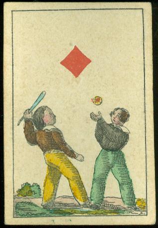
mark for both. It's this Kinderkarten II deck that has designs, which are much
more similar to those in our deck (except for
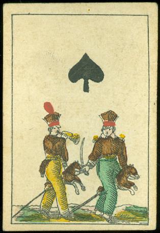
the kings) than to Niebuhr's Kinderkarten deck. First we will use some cards from the
Kinderkarten II deck for a comparison with our deck on this and the next
pages. On a separate page we will show the cards from the Feine Hamburger
Kinderkarten deck by D.A.C. Niebuhr and come up with an inconclusive conclusion.
Our deck measures 38 x 56 mm, the Kinderkarten II were described as 37 x 57 mm.
|
|
|
|
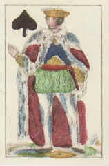
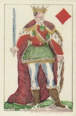
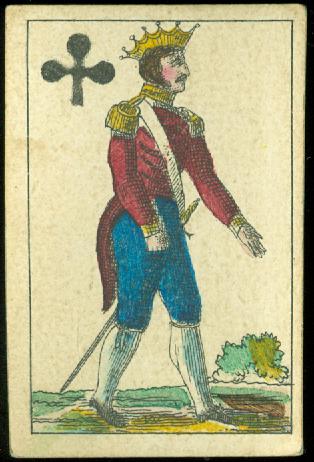
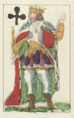
We think it's sufficient to show one of the kings from our deck for a comparison with the kings from the Kinderkarten II deck. The difference is obvious. The kings on the Kinderkarten are dressed as royalty, wearing capes with ermine boarders. The kings in our deck look more like they are dressed for the battlefield. But besides that the designs of these "royal" kings are clearly not as fine in printing and detail as in our deck.
|
Kinderkarten II |
Our deck |
|
|
|
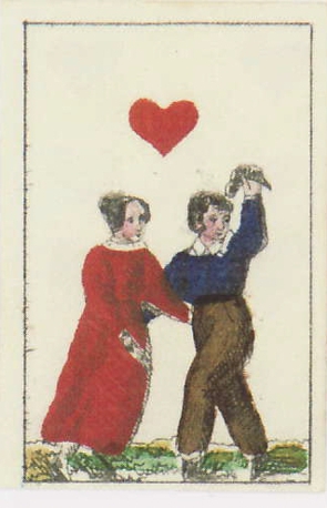
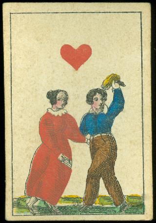
When we compare the cards in enlarged images, it becomes clear that the decks were not printed on the same stones. It may be influenced by the fact that the images of the Kinderkarten II were taken from pictures of the pages in .pdf format and converted to .jpg files, while our own cards were scanned directly, but it seems that the designs in our deck are generally finer in detail and printing.
But it's also obvious that the designs were redone. Here above it's not only the bush in the background that's added or left out, but it's also clear that the details are different: club, hair, face and lines for shading have been done differently. And you'll find these small differences on each card. Here below: 3 or 4 buttons on the blouse and where's the bottom part of the dog's stick?
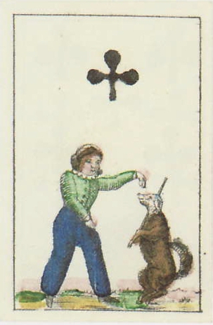
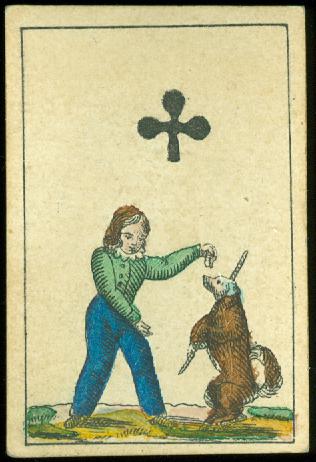
Although there are small differences in tone, the color scheme for the clothing and props in both decks is roughly the same.

-1- -2-
-3-
KINDERKARTEN I
or
BACK