Just
like the "Joker of the Month" in the Jokers section we will select a
"Deck of the Month" from all the decks that we could add to our
collection during that month. It will be what we consider our best find. We've
started this section in April 2007 and without any doubt we can say here that
over the years there will be antique, vintage and modern decks shown on these
pages. Age, design and value of the chosen decks may be very different each
time.
September
2026
 |
|
 |
|
I
already knew that there would be a problem with this month's update. I
was in Malmö for the annual IPCS convention, this time in combination
with the Swedish collectors club Chartophilia Sueciæ, which organized
the meeting from 2 - 4 October.
So I had to pick a deck before
I left on the last day of September. I already made the scans and basic
page here. The deck was meant to be in the Bargains section, but I decided to take it along for the trading session.
Such a nice deck would certainly attract a buyer. It did and is now in
the collection of a befriended collector from the UK. |
I came across this deck when I was going through the Modern German holders
looking for the Siegfried Heilmeier decks in our collection. I had forgotten all
about it, but immediately remembered it as a love at first sight when I found it
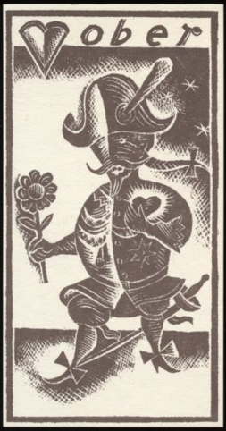
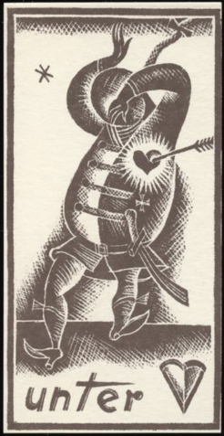
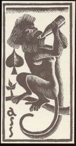
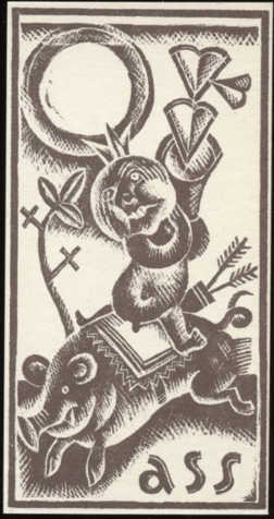
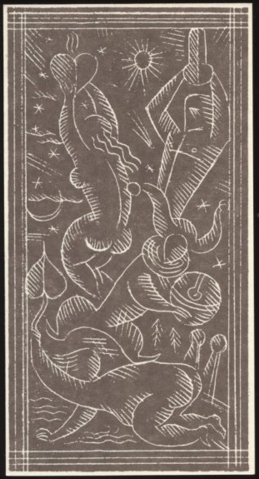
at a collectors meeting about 13 years ago. I was mesmerized by the artistic
designs and the unusual printing technique. And still am!
The
deck was created by Jakob Benjamin "Cobi" Reiser. He was born in
Munich on June 26, 1902. He attended the Fachschule für Buchdruck und
Chemigraphy (Technical School for book printing and chemigraphy) and later, after 10
semesters, graduated from the Munich State School of Applied Arts. But in
between he also studied fresco painting for one semester at the Academy of Fine
Arts in Munich with professor Feuerstein. During his life he was a versatile painter, artisan, and wall designer, who especially worked with murals, mosaics, and sculptural pieces.
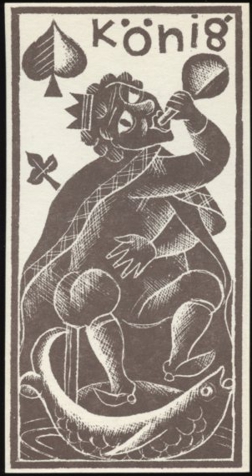
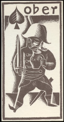
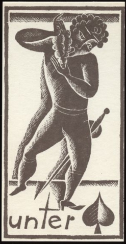
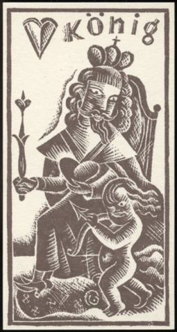
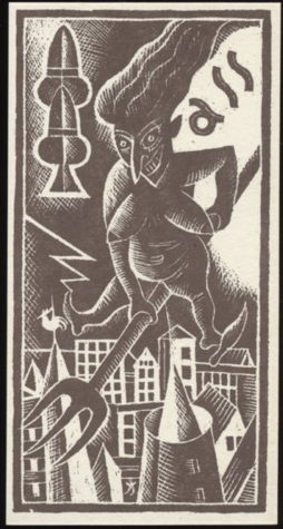
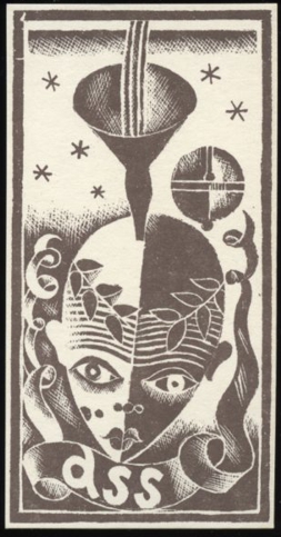
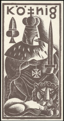
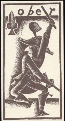
But all his later work is more commercial and in style quite different from these designs for his deck of
cards. Besides artist, he was also an avid mountaineer. Cobi Reiser died on
May 15, 1992.
The deck is dated in the accompanying leaflet as 1925. At the age of 23 Cobi Reiser must have seen samples
of Expressionism, Cubism and Surrealism while growing up. It seems as if he used these
influences
to create a style of his own for this deck, a style which completely disappeared
in his later work. I don't know how the makers of this edition came to
dating it as 1925, but the used technique for the original deck was chemigraphy,
a technique based on zinography, which had already been in use since it was
invented by H.W. Eberhard in 1804. Cobi Reiser had probably already learned this
technique during his time at the Technical School for book printing and
chemigraphy. So I'm inclined to picture Cobi as a young artist, just finished
with his artistic education and confident enough to proclaim himself as owner of
the Spielkartenfabrik Cobi, a playing card manufacturer. But I guess it never
came to a second deck and it's even unclear to me that the deck below was made
as a specimen or part of an edition in small numbers. The accompanying leaflet
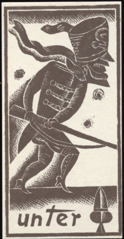
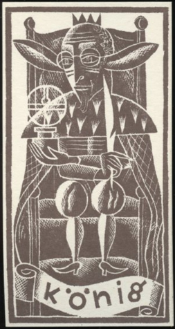
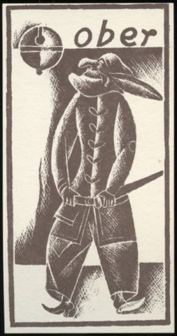
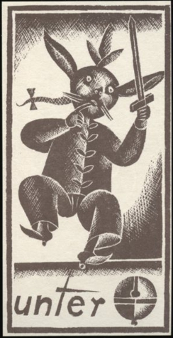
doesn't give a clear answer about that either. Still, a nice non-standard Jass
deck of 36 cards with German suits and...... great graphics!
Here displayed at 150% to show
more detail.
 |
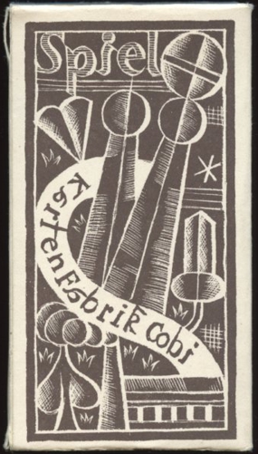
An
example of the backs on the left and on the right the front of the box.
All sides of the box are blank.
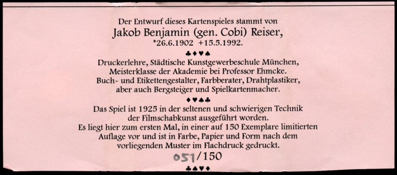
So the relevant information about this publication has to come from the
added piece of printed paper that came with the deck. However, there is
no information to be found about the publisher or year of publication.
Most of the given information I've discussed above, but the last
paragraph has an intriguing text. The German translates to:
"It appears here for the first time in a limited edition of 150 copies and is
printed in color, paper, and shape according to the present specimen in
offset."
I'm not sure if it means that only one copy existed or that there have
been more decks, of which one of them was used for this numbered 051/150
publication. |
|
 |
BACK
TO PRESENT MONTH