 |
 |
|
|
|||
 |
 |
|
|
|||
 |
 |
|
|
-2-
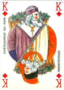
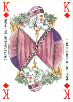
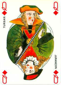
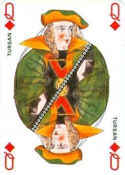
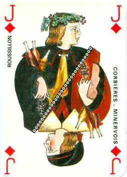
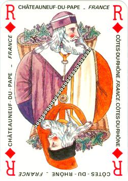
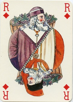
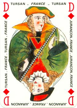
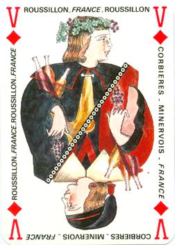
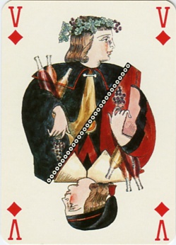
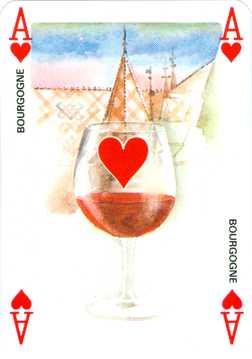
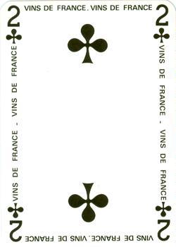
In the third edition the double image is still there, but now -for some mysterious reason- only shows the same image twice. This means that on each card one wine region had to disappear. We wonder if the artist was ever consulted about that and who has decided which wines could stay and which had to go. Okay, here below we too would prefer the Chateauneuf-du-Pape over the more simple Côtes-du-Rhone wines, but the choice wasn't always that easy.
|
|
|
|
|||
|
|
|
|
|||
|
|
|
|
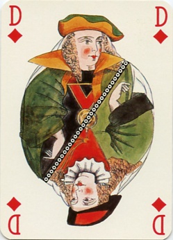
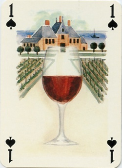
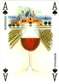
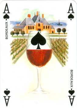
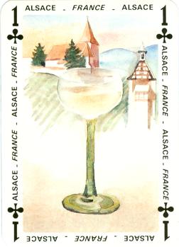
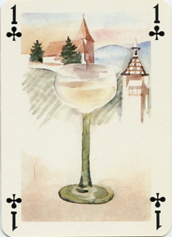
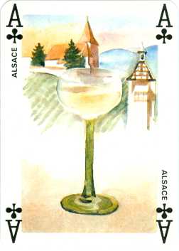
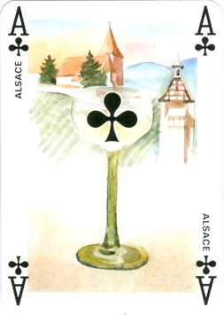
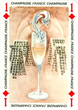
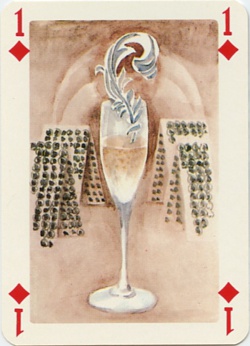
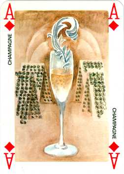
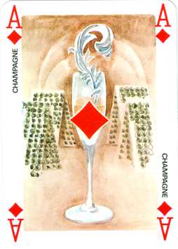
The aces in the first edition still have the 1 as indicator, which is quite usual in French decks. In the third edition a suit sign has been placed on the glass. A reason for this could be that the English and American players are used to a suit sign in the middle of the aces. Here that spot fluctuates, as the place of the glass isn't always the same within the design. Only the diamond on that ace is right in the center, all the others are (a bit) off.
 |
 |
 |
 |
|||
 |
 |
 |
 |
|||
 |
 |
 |
 |
|||
 |
 |
 |
 |
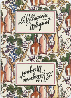
The first edition came with an explicative leaflet, with detailed
information about the wines and regions. The text is all in French, another hint
that the deck was aimed at the French market only. In the second edition box
and back-design are the same, but the accompanying leaflet is in French and
English now. This leaflet was not published with the advertising deck. There was
no reason as it wasn't intended to promote all the different wines, but just the
(drinking of) Villageoise Margnat. That's also the reason for the absence of the
names of all the wines.
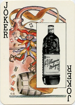
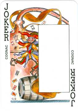
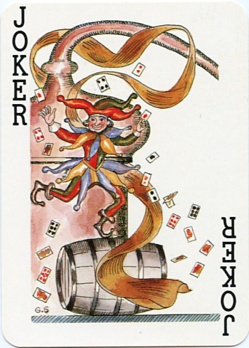
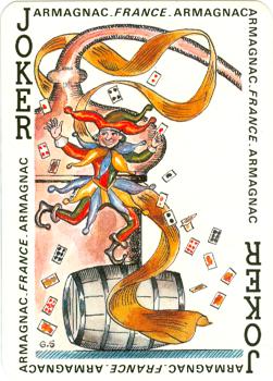
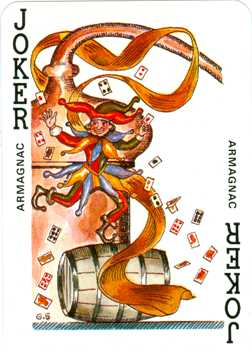
All editions come with the title card and the jokers have the same
design too, although the one with the rectangular white advertising space will
probably exist with other advertisers too.
 |
 |
 |
 |
|||
 |
 |
 |
 |
|||
 |
 |
 |
 |
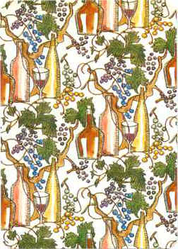
The third edition has a completely different back design, but the leaflet is the same as in the second edition. It's dated on the box as 1994.
In conclusion we feel that the original French wine, with a solid outlined body, has been diluted a bit and what has been left is half a bottle for the tourists.