January 2020


It's fun, browsing though the 7 boxes with decks from the LB collection, that I will still have to process into our collection. There are still some gems to be found in them. On the other hand it means shifting at the same time and a goodbye to decks that would be new to the collection. Ever since we had decided that a downsize of our collection was unavoidable, we knew that we would have to go through our collection to decide which countries and decks would stay. I miss Miriam's input, but will honor her preferences.

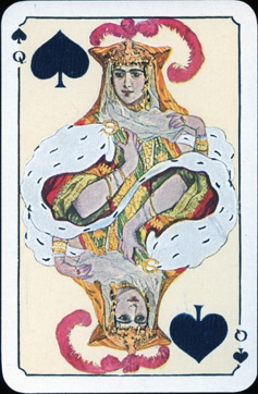
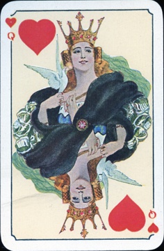
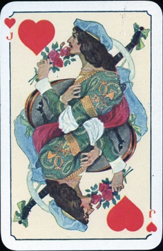
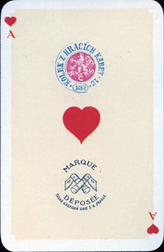
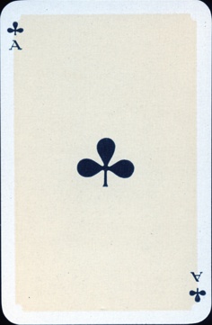
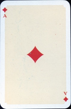
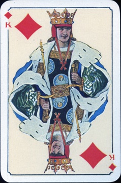
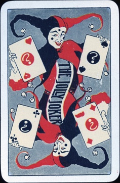
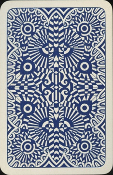
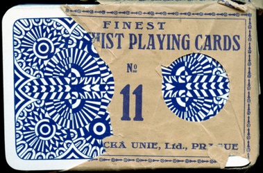
In our collection we keep the courts, aces etc. in sheets, separated from the rest of the deck. So the easiest way was to go through these non-processed boxes first. It makes you feel a bit like God, deciding on which decks may stay and which will have to go. She loved Art Deco and Jugendstil design, so I'm sure that Miriam would have agreed that this month's deck is one that will certainly stay!


The deck was printed and published as "Finest Bridge-Whist Playing Cards No. 11" in 1920 by the Ceska Graficka Unie S.A. from Prague, Czechoslovakia. Thanks to our Czech fellow collector Zdenek Hanuš we now know that the deck was designed by the Czech painter and illustrator Artuš Scheiner (1863 -1938) and his designs of the courts are magnificent. The costumes are lavish and ornate, the headwear with feathers and high-spiked crowns almost over the top and all the figures are done in a pleasant Jugendstil style..... chapeau!
The indices are English and because the text on the wrapper is mostly in English too, I suspect that the deck was also aimed at tourists and/or export abroad. The deck also exists in a patience size, published as a double deck.

Just like in the deck of December 2019 the suits in this deck each have a dominating colour too, here red in the spades, green in the hearts, purple in the clubs and blue in the diamonds. 


The aces are plain. On the AH is a Czechoslovakian tax stamp of 10 Kc (korun ceskoslovenskych) as well as the manufacturer's logo. This tax stamp was used since the end of WW I until 1925. The R C S refers to the Czechoslovakian Republic and the 12 to the stamping office.


There's no greater contrast in the deck than between the courts of the clubs and diamonds suit. The combination of purple and black gives the courts in the Clubs suit an ominous look, the expression on their faces is severe and determined. King and Jack are ready to fight. But they have nothing to fear from the courts in the Diamonds suit. Those are all smiling and peaceful, enjoying flowers and music. And of course it helps that the light blue is a much opener colour than purple.


The back design is titled Butterfly.


There's a Czechoslovakian tax band on the back of the wrapper, with indication of the applied law and the amount.


BACK TO PRESENT MONTH