|
When two editions of the
same deck are found, naturally the question arises which one came first.
In the WOPC article by Paul Symons about this deck he also shows the 2
editions, but I tend to disagree with his sequence. For that reason I
have composed this comparison of each card and have turned the sequence
around. Paul's 1st edition is the 2nd edition here below.
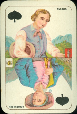
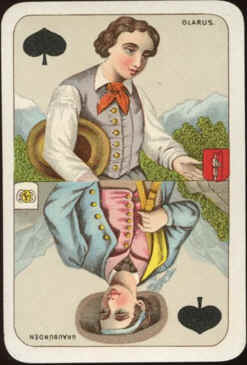
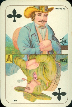
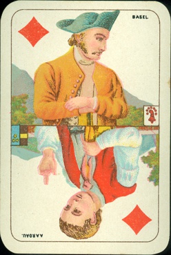
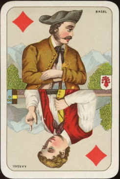
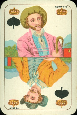
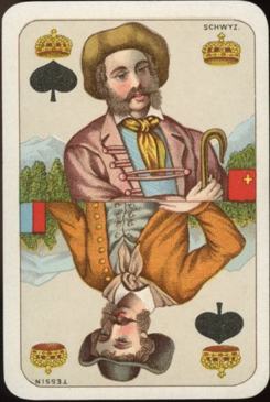
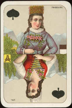
There are a few reasons for me to have changed it. Although both decks
are printed in chromolithography the quality of the artwork is quite
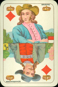
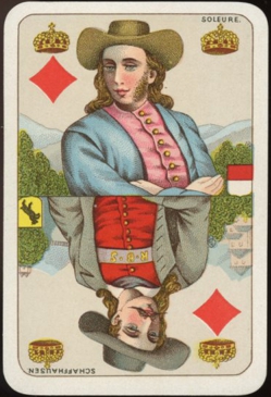
different. In the 1st edition here below all the faces are not very
outspoken and moustaches or side-burns lack credibility, some even look
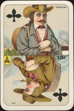
amateurishly done. The artwork was much improved in the 2nd edition by
adding more detail and shadowing. Same was applied in the clothing and
the background scenes. Definitely another artist was assigned.
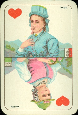
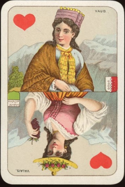
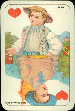
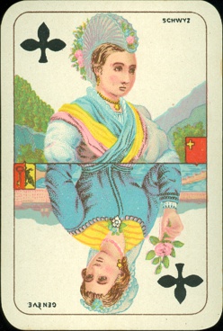
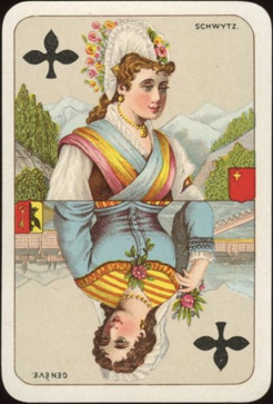
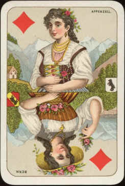
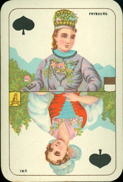
The figures and costumes of the different cantons remained basically the same,
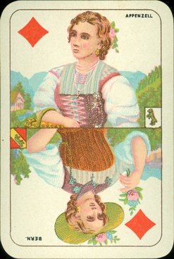
with the exception of the QH, which was completely redrawn. And can you
blame the young lady from the Vaud canton for looking unhappy about the
way she's portrayed in the first edition? Her successor in the 2nd
edition looks much happier, even a faint smile on her face. That faint
smile is applied on other queens, some jacks and even the king of
hearts. It gives the whole court a more pleasant look.
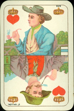
A personal annoyance is the
blue smoke coming from the pipes on the KH. And who puts a pink pipe in
a pink hand? Glad to see that it was redone in
a more realistic way in the second edition.
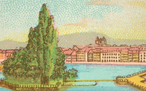
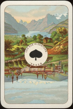
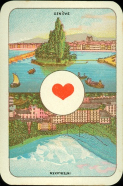
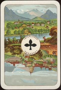
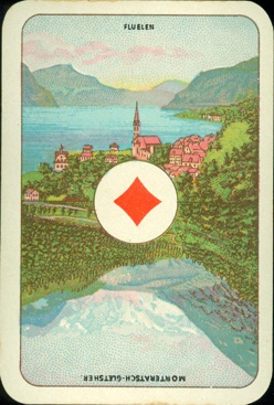
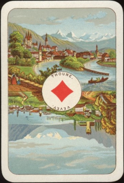
In that edition the aces have also been redrawn completely and now show
different scenes. The placing of the names has been changed to the
center circle, except for the ace of hearts, which remained nameless.
Probably to leave space for the tax stamp. Although nameless, at least
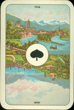
one of the scenes is that of Genève. Although redrawn, two other
scenes have remained the same too: both Thun (Thoune in French)
and Vevey went from the AS to the AD.
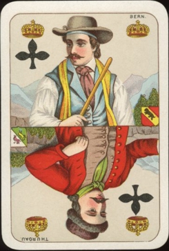
A last difference is the background of the courts. Obviously a whiter
card was chosen for the 2nd edition and a light gray background
within the gold outline is well visible against the white outer border.
Absent in the first edition, here it helps to add snow white on some
mountain tops.
With all these improvements the sequence is obvious. Why would Wüst
replace a good quality deck by a lesser one? The opposite is a more
plausible answer. Paul dates the deck as c1900, but mentions that his
second edition was probably published "at about the same
time". I think that Wüst probably waited until the first edition
was nearly sold out and then launched the second edition. So it may only
have taken 1 or 2 years, which is still at about the same time. |