December 2012
 |
This month
started and ended with the Dutch trading meeting in Velddriel on the
9th. After that there were no main events, just a few local flea markets
to visit. Unfortunately Miriam's health didn't allow her to participate.
Joop came back empty handed from the flea markets, but had returned from
Velddriel with his bag full of decks. A good number of them went into
our collection, others were put up for auction. During the last couple
of months our Ebay auctions did very well, so we could afford to spend some money
there too. All this resulted in an interesting short list again. Most of them were
modern designed non-standard decks, like the 1959 and the 1970 Loewe deck by Fournier,
a M.A.D. deck with interesting artwork by a Turkish designer, the
Russian Petropolis deck, an Estonian art deck or a cute 1939 Italian
miniature Fortune Telling deck, illustrated by Sebastiano Craveri with
animals from his famous "Zoolandia".
|

|
|
But our choice for this month arrived just before
Christmas and it surpassed the whole short list in one stroke.
|
Joop must have picked up
a slow bug in Malmö in 2011. Until then we hadn't bought old Swedish
decks for our collection for years and now three in one year. Or maybe he has been studying
that fine catalogue of Scandinavian playing cards too much (thanks again, Ali!).
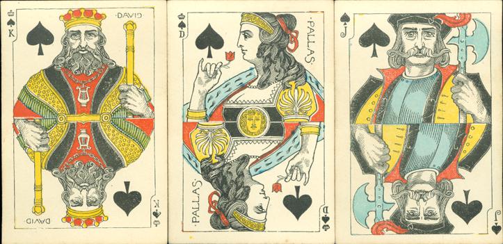
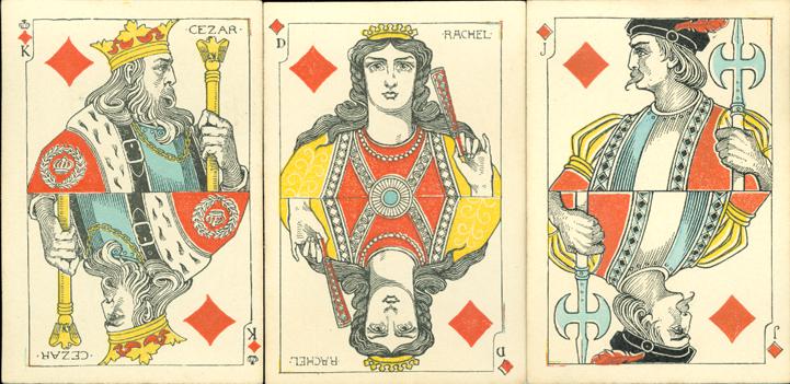
Anyway, this month we chose this deck by A. Boman from Stockholm. Our deck is
from the first edition, published between 1900 and 1901. It was
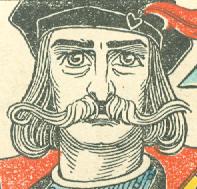
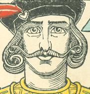
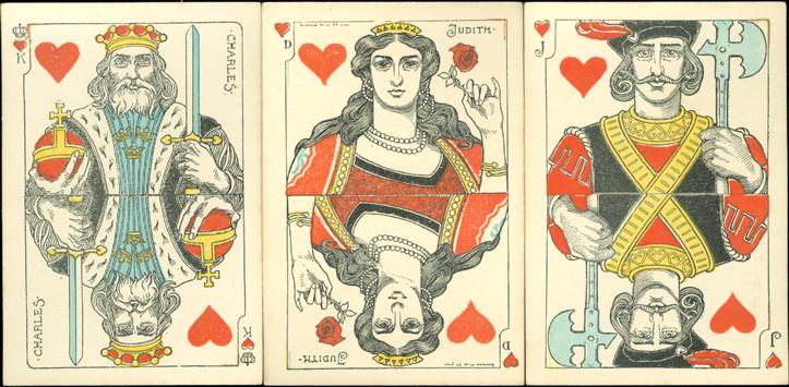
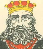
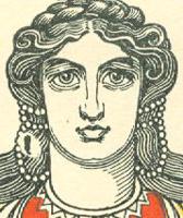
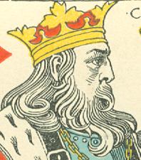
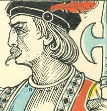
designed by the Swedish artist Gunnar Hallström and it were his strong faces that attracted us most and made us decide in favor of this deck.
Three courts are in profile, the others sort of stare into the camera, some with
almost mesmerizing eyes. The Jugendstil like designs reminded us of the b/w graphic work of Jan Toorop, a Dutch artist who
also had his heydays around 1900. That carefully stylized and elegantly curled
hair, it was en vogue in the those days.

In the last Deck of the
Month (November) we wrote about the hands in the designs of the courts.
Were they a bit fragile there, here we have solid, strong hands on the Kings and
Jacks and firm, but elegant ones on the Queens. They all have their pinkies up, even when holding a
simple flower.

|
The deck is printed in simple lithography.
Only 3 colours were used: red, yellow and blue. The last two were also used
for the 3 crowns, a Swedish national symbol since the 14th century, on
the chest of the King of Hearts. The bodies and faces of
the courts remained uncoloured. This definitely creates more attention
for the designs and adds to their strength. In the second, partially
redesigned, edition of this deck, which was published from 1902 - 1909,
not only the indices were left out, but the faces were coloured in
a plain pink. In our opinion that took away some of the strength of the
designs. In 1901 a poker edition of the deck was also published. The
faces were not coloured, but there's no outline on the courts and a
stern, large index was used there. Also a joker was added . That joker
wasn't designed by Gunnar Hallström, but by Albert Edelfeldt.
|
 |

|

|
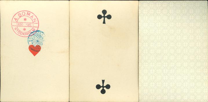
| The Ace of Hearts has two stamps. One is the
Swedish tax stamp, the other the manufacturer's stamp, which not only
mentions name and place, but here also "1830 - 1900". The
company of A. Boman was founded in 1830 and the deck published in 1900.
Although the courts all have indices, there are no numbers on the aces and
pips. |

Sometimes there's
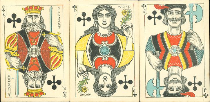
an oddity to be spotted at closer look. In this deck we came across four of them.
The first one
concerns the indices. They seem to have been drawn by Gunnar Hallström as part
of the design. On all the
Kings and Queens the small sized indices have a different shape or setting. But on the Jacks, three
of the somewhat larger indices look fairly alike and end in an elegant curl. However, the Jack
of Diamonds has a simple J.
Secondly, all the Kings can be recognized as such by the crown above their suit
sign. But why is that same distinction only bestowed on the Queen of Spades?
Thirdly, all the designs have an outline. On eleven courts the upper right and
lower left corner in that line are rectangular. Only on the King of Hearts these
corners are round.
And last, but certainly not least: all the Kings and Queens carry names, the
same ones as in the suits from the French pattern. For some reason the Jacks were left nameless, but that's not
what was bothering us. It's that poor Queen of Clubs. Not only is she the only
Queen without a crown on her head, but her name is misspelled too. Here she's
named Arcine, while she is called Argine in the Clubs suit of the French pattern. The
origin of that name isn't as clear as those of the other names in the French
pattern, but the common census is that
Argine is an anagram for Regina, meaning Queen in Latin.
We wonder if these oddities still appear in the second edition. Anyone to
answer that?

Gunnar Hallström
 |

|

|
|
There's not
much to be found on the internet about this artist. He was born in
1875 and died in 1943. Between 1893 and 1897 he was a student of the Art
Academy in Stockholm and he continued his art studies in Paris. He has
traveled through Scandinavia, Europe and Russia
extensively, before
he was |

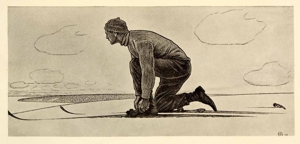
Ski Binder - dated 1911, but signed 1909 
|
appointed
director of the Art Academy in 1910. As an art student he had won awards
and scholarships there and he did the designs for the deck at the age of
24 in 1899, according to the signature on the QH. In his 1909 signature
the swastika like design refers to the same symbol as in our 01/12 deck. |
BACK TO PRESENT MONTH
