April 2011
 |
April was a hectic month. The first two weeks Miriam was in hospital
and since then she has been recovering further at home. So Joop's spare
time is limited by the household chores now too. Priorities had to be
set, but he managed to get the two major events in April on his list. So
the largest collectors fair in Utrecht was visited on 2 days and a week
later the meeting of the Dutch collectors in Nieuwerbrug was attended
too. Both brought a few new decks and Ebay brought some too. But in
April we always have to wait until the last day before we can make a
final choice. Each year on April 30 the Dutch celebrate Queens Day and
on that day there are free markets throughout the country. Each year we
go to Hoorn, a nearby, nice old Dutch town, and you never know what you
might find. Fortunately Miriam felt well enough to come along, but we
didn't find any decks that would earn a place here. Although
the total score this month was a mere 9 decks, at least there was something to
choose from.
|
|
The shortlist contained a nice c1905 Canadian
Railway Souvenir deck and a Belgian deck with the not often seen "Iznogood"
comics characters, an obscure German limited and numbered edition of
"Erotic Skat" and this deck, which is obviously a numbered and
limited edition too. We chose it because of its Dutch origin and the
fact that it's a rarely seen deck nowadays. |
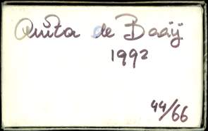
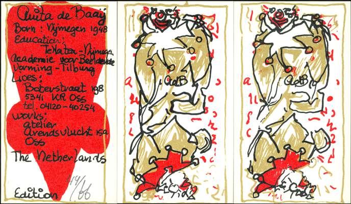
It was made by a
Dutch artist, Anita de Baay, and published in 1992. The edition was limited to
66 numbered copies. I was told that in 1992 the deck was sold at 150 guilders.
The printing technique used was silkscreen and it was printed in three runs. In
the early 1990's Anita de Baay made prints and paintings in a sort of double
imaged style and from this the idea of making a deck of cards was born.
Anita
de Baay is a female artist from Oss, in the province of North Brabant. She has
had exhibitions throughout the Netherlands, but mostly in her own province. She
uses a variety of techniques such as painting, drawing, watercolors, silkscreen
and linocuts for her artwork, which leaps between figurative and abstract and
visa versa, but is always colorful and vibrant. Here with a touch of
eroticism. She is currently teaching drawing and painting at De Muzeling Art
Centre in her hometown.
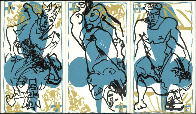
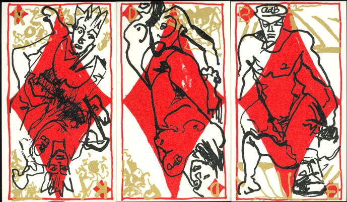
The artist has signed
all the cards. The signature (AdB) was part of the design and helps to determine
how to hold or show the cards. We were a bit disappointed with the fact that
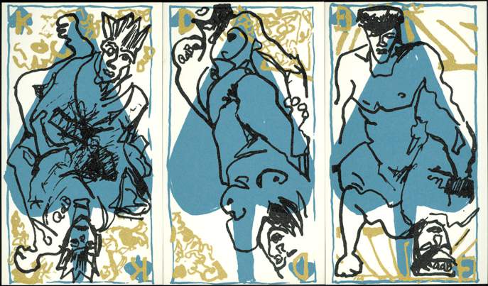
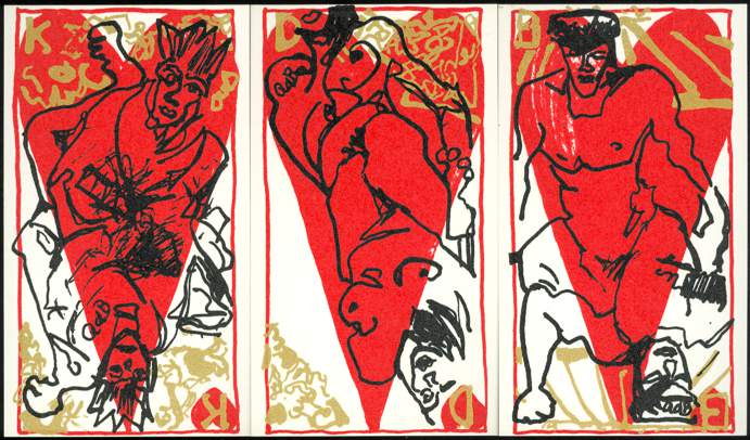
there were only 3 basic designs used on the court cards, but surprised to see
that although close, there are differences between the court figures on the
Spades and Hearts and those on the Clubs and Diamonds.
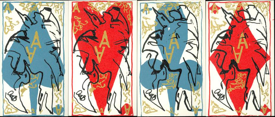
The same goes for the
birds on the Aces, close but with small differences between Spades/Hearts and
Clubs/Diamonds. And these differences are not in the black figures only, but
also in the gold colored embellishments and lettering.
The cards are
printed in 3 runs. The background is made up by an outline and suit symbol. A
second layer with embellishments and letters in gold color is printed over the
background design and the figurative designs in black make the top layer.
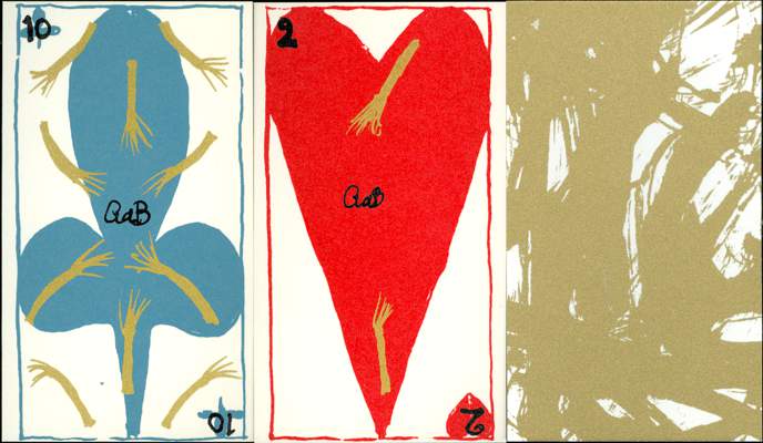
The pips don't have
gold numbers. Here the gold is only used for a number of symbols, that is
consistent with the card value. The black layer consists here of the numbers and
the signature. The backs are printed in gold color. At first glance they all
seem to be different in design, but by chance we saw that the backs of the Kings
of Spades and Hearts were the same. We haven't checked all of them, but they
seem to come in pairs. Some people might argue that one shouldn't play a game
with cards like this, but here the back designs look so much alike that chances
of recognition are negligible.
The deck consists
of 52 cards, 2 jokers and a numbered card with info about the artist. The deck
doesn't have a title.
BACK TO PRESENT MONTH