|
|
|
|
He studied at Denmark's Design School
between 1993 and 1996 at the
Institute for Visual Communication. He graduated there with a magazine project
called "Zeitgeist", with low-tech design as the theme. A travel–grant from
this school
made it possible for him to meet and interview designers in London and California.
Directly after his graduation he was employed by the
Månedsbladet Press until 2000 and started working
as a graphic designer on monthly magazine 'Press', with graphic designer Marie Lübecker.
This cooperation led to his co-founding of 'e–Types ApS' in 1997 on the side.
ApS stand for Anpartsselskab, a private limited company. It lasted until 1999.
In 2001 he was the co-founder of Legalizer ApS, an agency which was supposed to
create new ways of developing and implementing communication. They had skills
regarding everything from printed matter to events and made a political
campaign for the national elections in 2001. From 2003 Leo ran Legalizer on his own, with a
few employees.
In 2009 he settled as a free artist and went on as
Leo Scherfig, grafisk design. His clients include book publishers, music
venues, theatres, film companies, newspapers etc. In 2011 he made a stamp for the
Danish Mail and in 2012 he was selected to make the annual poster for Copenhagen
Jazz Festival. In 2014 he received »Statens Kunstfonds treårige
arbejdsstipendie«, which is not only a great honour, but also a generous grant.
In 2018 he moved to the island of Møn, where he continues his work with
graphic design's many different expressions. He also makes linocut prints and
since 2021 his interest in playing cards grew. Already owning a small
collection of selected decks, he started to produce his own decks as Moon
Playing Cards.
These two aspects, the designer and the collector, come to expression in the
decks that Leo has produced. The first and fourth deck (with the 2 Sixtyfivers
follow-up) are definitely the collector's choice and done in a classic design.
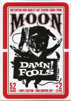
The other three decks are closer to the artist's modern graphic design. Decks 2
and 5 consist of collages in black and white, which is probably the closest to
his present graphic designs as an artist.
The 3rd deck has a more stylized, yet playful design, in line with his poster
design for the Jazz festival of 2012.
PICK A BOX TO SEE THE CARDS........
 |
|
|
 |
|
|
|
|
Because the Old School deck
and the Damn!Fools deck were the only large editions, these are still for sale
at Leo's website: moonplayingcards.
All the other decks were published in very limited editions and are sold out.
However, if you really want one, contact me. I still have one of each to sell.