 the
HEINEKEN variations
 the
HEINEKEN variations
|
|
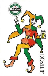
This Heineken joker may be
called the father of all Heineken jokers. |
|
|
|
|
|
|
On the left: the English version of the SN joker (pics from the collection of Gino Vaneeckhoutte) |
||
All the Heineken jokers that were made by Carta Mundi use a slightly smaller lettering and can be identified by the fact that the word "joker" ends almost on the same height as the bottom of the foot, as shown here below.
|
|
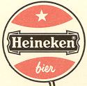
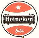
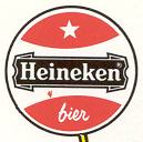
When a joker has been in production for such a long time, it is not a surprise that small variations will be found. We have found 10 different variations in the Carta Mundi version. To show these differences each joker is accompanied by 2 pictures. One shows the shield that the joker holds and the other one the glass in his other hand. In these two items most of the sometimes difficult to distinguish differences can be found. |
|
|
|
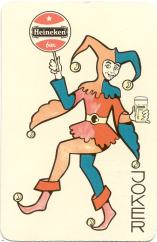
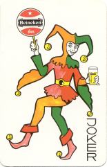
All the shown jokers hold a red shield with the Dutch word for beer, "bier". These jokers can be found in decks that were made for the Dutch and Belgian market. Although colour differences in the green parts of the design can be found, we don't count these as variations. The mixing of colours wasn't always a computer directed operation and in the process of printing some colours may run out a little earlier than others. All this may influence the final outcome of the colours in the design. To illustrate this we show the first joker here below. It has blue parts instead of green ones. A rare version? Looking at the glass there's a very pale beer in there. The almost complete absence of yellow here causes the blue colour and also the somewhat paler red on the shield. So it's better to call it a misprint!
 |
 |
 |
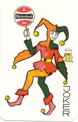 |
|
But this misprint also shows a difference in the froth. The SN and first Carta Mundi joker have an exuberant froth. |
Also the name "Heineken" is in full front now on each of the glasses in this row. But these low froth jokers hold some differences too. |
Some jokers have a small green scribble below the word "Heineken" on the glass. |
On this last joker it is the Heineken star that returns on the glass. This time in red. |
  |
|
  |
  |
|
|
|
|
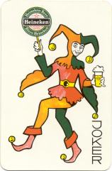
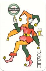
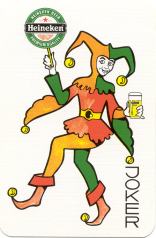
On this red shield the English word "beer" is used. It is probably one of the first jokers that were used in decks that were made for the international market. The design of the glass and the exuberant froth indicate that it was directly derived from the first SN joker and is the same as on the early Carta Mundi jokers from the 1970's. Here below some more "internationals"............ |
|
|
|
 |
 |
 |
|
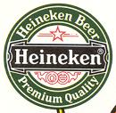
Their shields show differences in text and fond types. The first 2 glasses still have the exuberant froth, but already the word "Heineken" is in full front here. A red smudge above it has been added to the red stripe that is on the SN and older CM jokers. The later ones (low froth) also have a full red star on the shield instead of the red outlined one. |
|||
  |
  |
  |
  |
These are all the variations that we have in our collection. But we can imagine that there are others too. So if you have a variation that isn't shown here, please send us a scan of it and we'll add it to this page. Maybe it is possible to get a complete picture of all the possible variations. So...............CHECK YOUR COLLECTION!
|
|
 |
||
|
The first
addition came from Gino Vaneeckhoutte from Belgium. Here there is
an outlined star and low froth. The two lines on both sides of the star
have been exchanged for "trade"and "mark", just like
in the later designs. Also the drawn design beneath the word Heineken is
that of the later variations, just like the font that is used. |
|||
  |
  |
||
last update: 8/01/2021